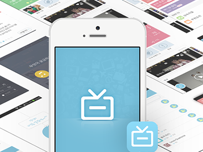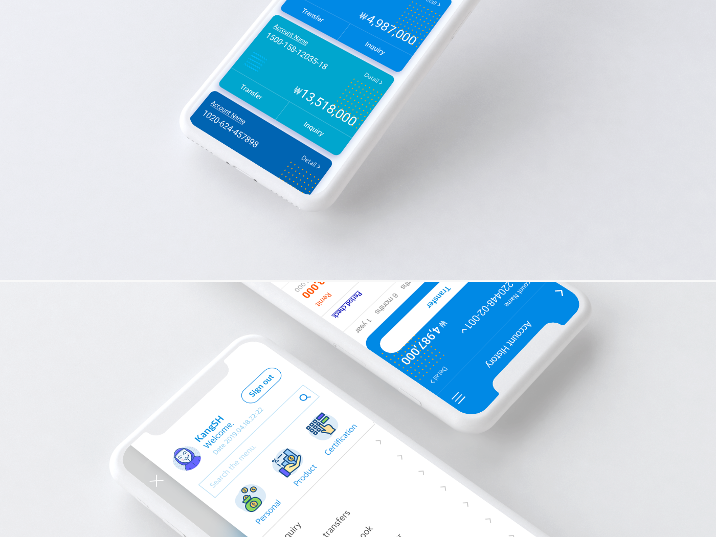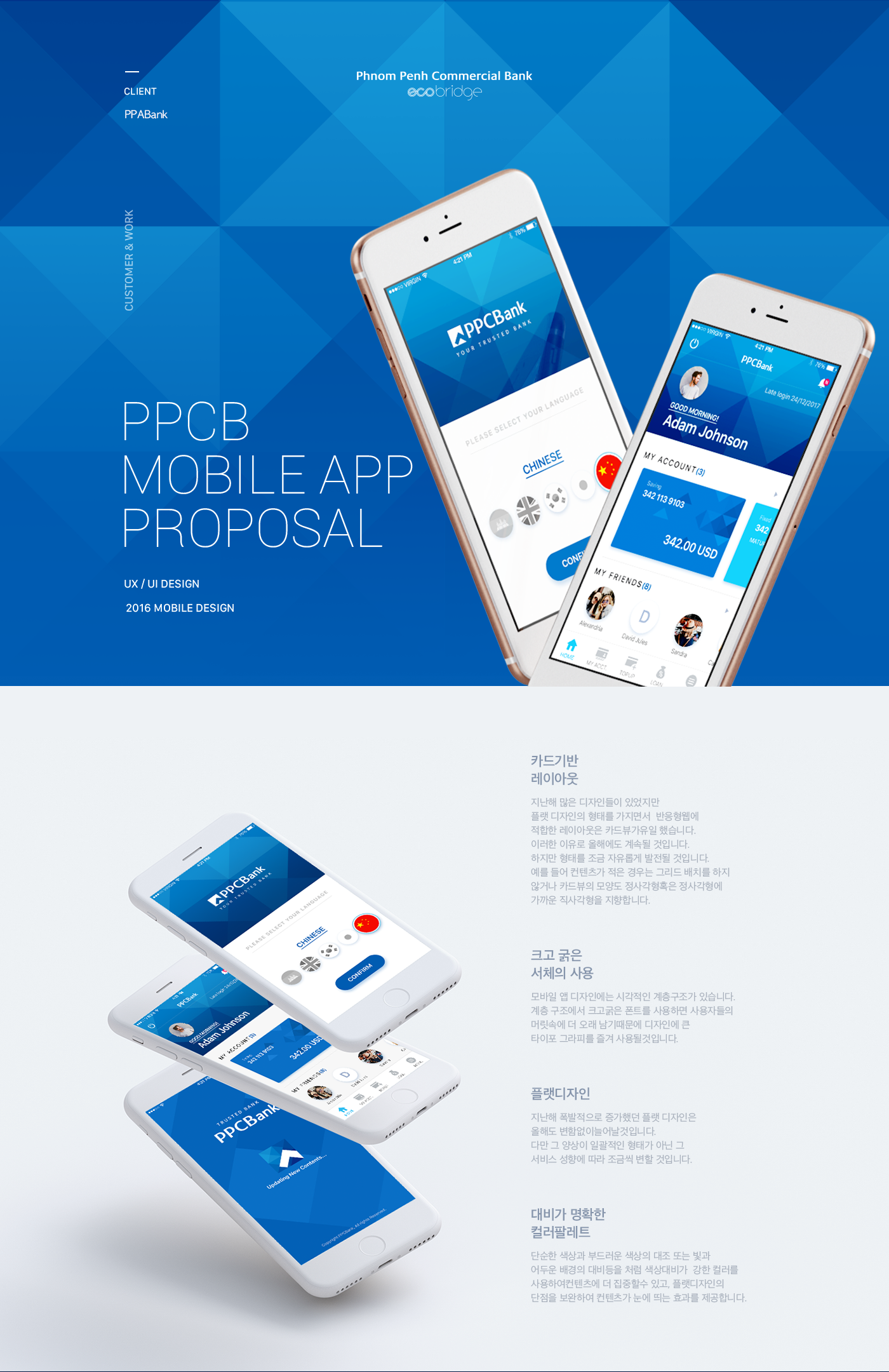
PPCB Mobile App
카드기반 레이아웃
지난해 많은 디자인들이 있었지만 플랫 디자인의 형태를 가지면서 반응형웹에 적합한 레이아웃은 카드뷰가유일 했습니다. 이러한 이유로 올해에도 계속될 것입니다. 하지만 형태를 조금 자유롭게 발전될 것입니다. 예를 들어 컨텐츠가 적은 경우는 그리드 배치를 하지 않거나 카드뷰의 모양도 정사각형혹은 정사각형에 가까운 직사각형을 지향합니다.
크고 굵은 서체의 사용
모바일 앱 디자인에는 시각적인 계층구조가 있습니다. 계층 구조에서 크고굵은 폰트를 사용하면 사용자들의 머릿속에 더 오래 남기때문에 디자인에 큰 타이포 그라피를 즐겨 사용될것입니다.
플랫디자인
지난해 폭발적으로 증가했던 플랫 디자인은 올해도 변함없이늘어날것입니다. 다만 그 양상이 일괄적인 형태가 아닌 그 서비스 성향에 따라 조금씩 변할 것입니다.
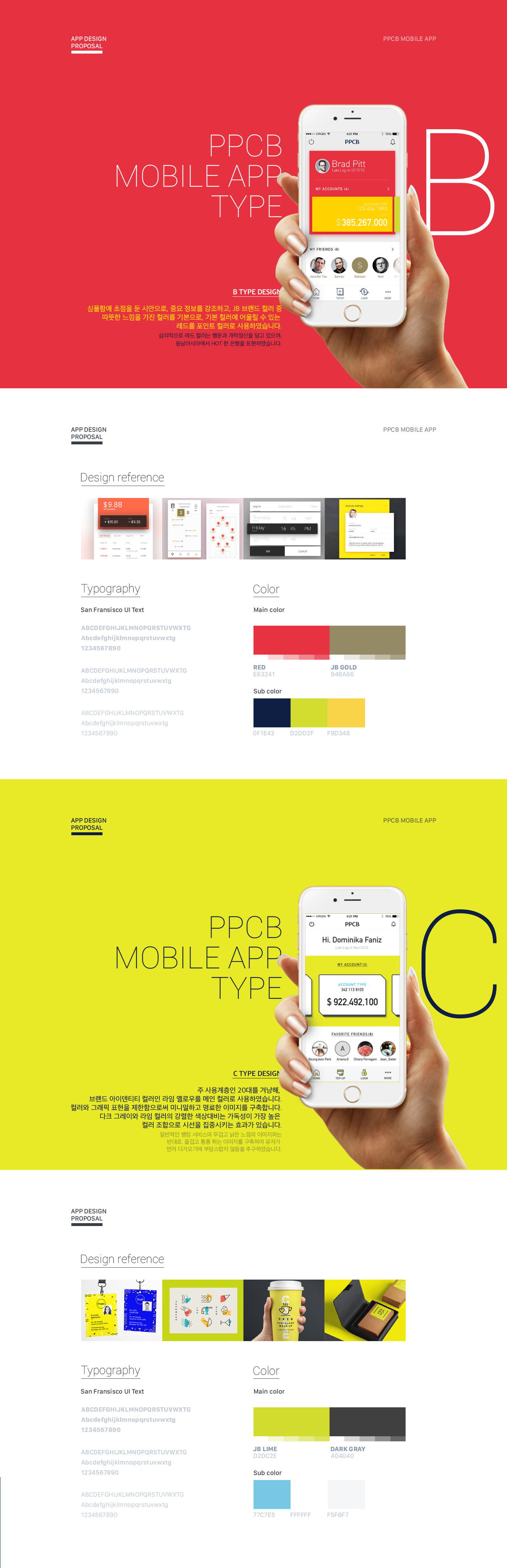
대비가 명확한 컬러팔레트
단순한 색상과 부드러운 색상의 대조 또는 빛과 어두운 배경의 대비등을 처럼 색상대비가 강한 컬러를 사용하여컨텐츠에 더 집중할수 있고, 플랫디자인의 단점을 보완하여 컨텐츠가 눈에 띄는 효과를 제공합니다.
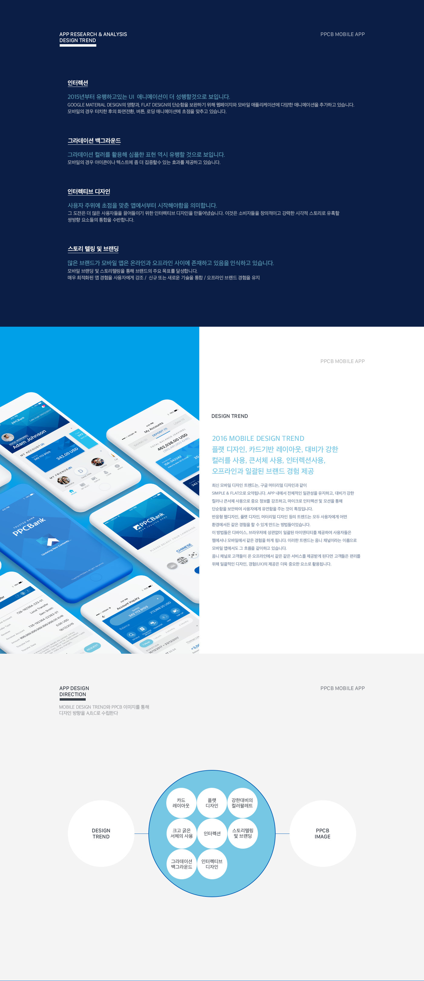
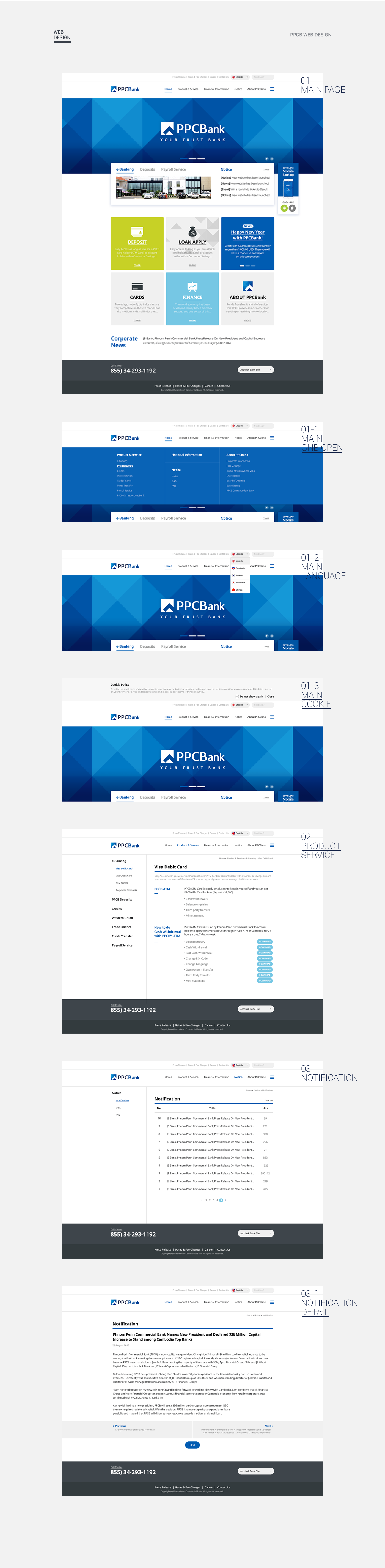
PPCB의 블루 컬러를 메인으로 사용하여 브랜드 아이덴티티를 명확하게 전달합니다. 삼각형 패턴을 곳곳에 사용하여 시각적 즐거움과 리듬감을 더하였습니다.
Review
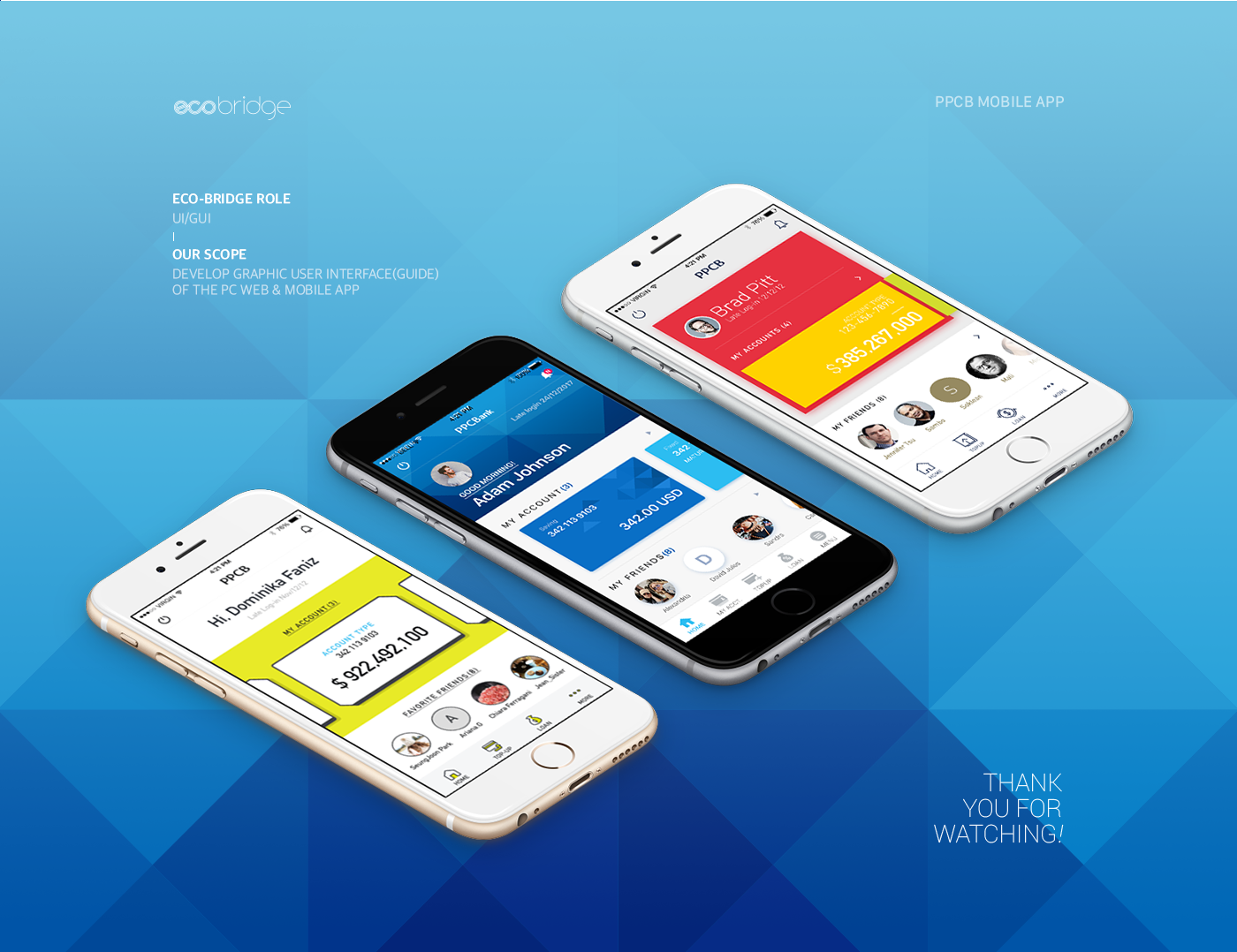
캄보디아 대표 은행인 PPCB App 프로젝트로
총3가지 시안중 패턴형식의 디자인을 채택하였고 이후에 디벨롭을 진행하여 무리 없이 진행된 프로젝트 였던것 같다.
개발 완료후에 캄보디아 내에서는 혁신적인 UX라고 평가 받으며 좋은 호응을 얻었다고 한다.
고생한 팀원과 좋은 기회를 주신 안명규 팀장님께 감사할따름!!
PPCB Mobile App
Card-based layout
There were many designs last year, but in the form of flat designs, the layout for the reactive web was the card view. For this reason, it will continue this year. But it's going to develop a little bit more freely. For example, if the content is small, do not place the grid or the card view is oriented toward a rectangle that is close to a square or square.
the use of large bold typefaces
Mobile app design has a visual hierarchy. Using large and large fonts in a hierarchy will help users stay in their heads longer, so they will enjoy using large typography in their designs.
Flat design
Flat design, which exploded last year, will continue to grow this year. But it's going to change little by little according to the nature of the service rather than the collective form.
a color pallet with clear contrast
The contents can be focused more on color contrast such as simple color, soft color contrast, or contrast between light and dark background.
The blue colour of the PPCB is used as the main to clearly communicate the brand identity. Use triangle patterns everywhere to add visual pleasure and rhythm.
Review
With PPCB App Project, Cambodia
It seems to have adopted a pattern-type design in three cities, and it was a project that went ahead smoothly by going through a develop afterwards.
After the development was completed, it was praised as an innovative UX within Cambodia and was well received.
Thank you, Mr. Ahn Myung-kyu, for giving me a great opportunity with a team member!!