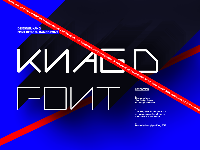
온라인상에서 공통적으로 사용될 로고가 필요하여
본인을 브랜딩해 보았습니다.
RED는 본인의 개성을 가장 잘 보여줄수 있는 KEY-Color 입니다.
"나눔"은 디자이너로서의 방향성인
'일방적이지 않고 함께하는 소통, 생각을 나누고, 이야기를 나누고, 디자인에 담다.'
를 표현하고 있습니다.
In order to produce a logo
Person I tried to branding the.
-
And alphabet Kang representing the principal
Is the design of direction to pursue the "sharing" is represented by works that were destroyed,
It means that it is represented by a design that collectively the two elements.
RED is the KEY-Color, which show best the personality of the person.
-
To share, some in the direction of a designer
"Unilateral communication together rather, by dividing the idea, is to talk, to fit the design."
It has to express.
-
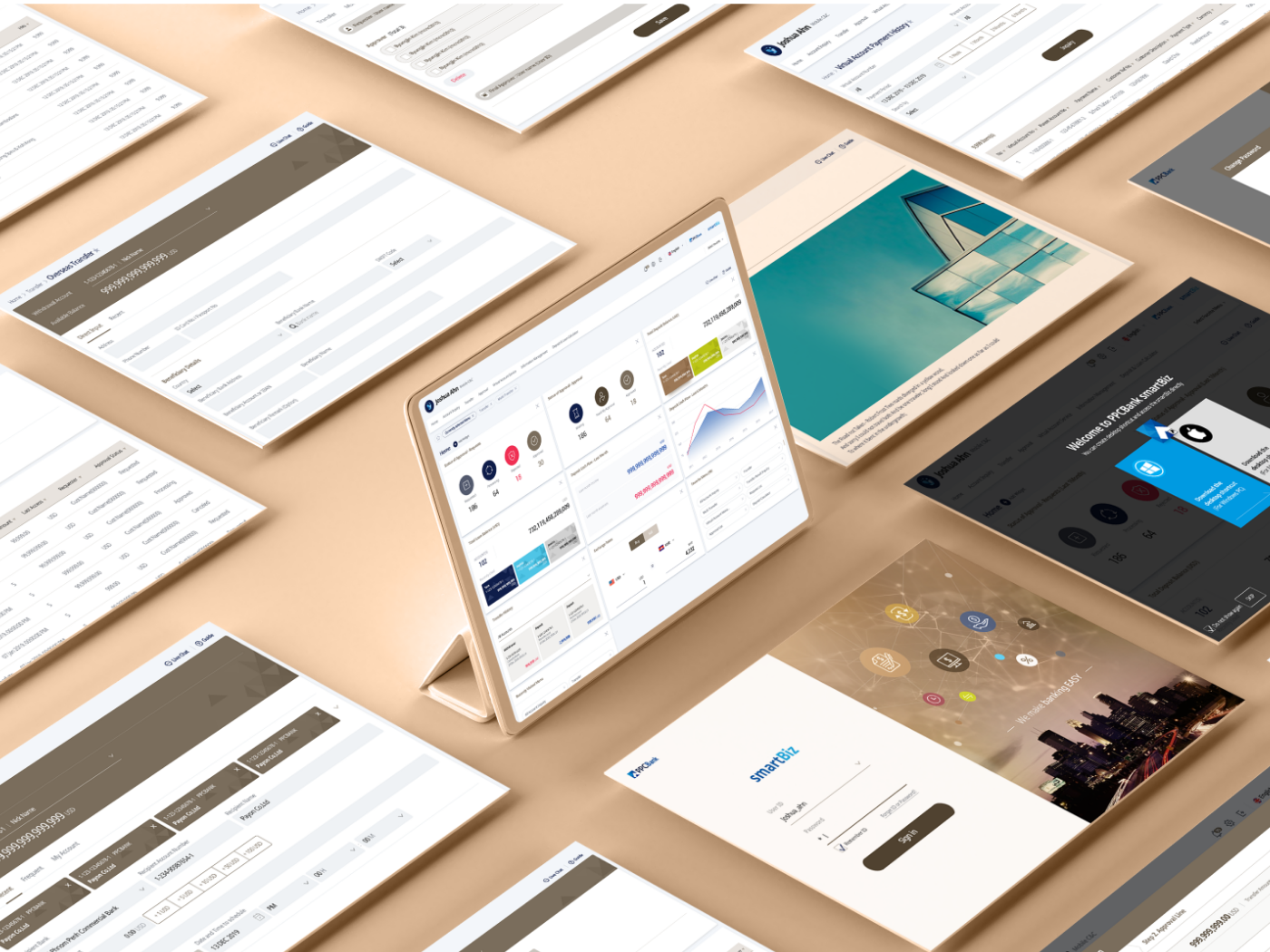
Although we use the Mockup image while advancing this work,
The next task time, you have the opportunity that can be fabricated to think to the actual shape Na say, a I.

